
Startbootstrap - Simple Sidebar 사용하기
Start Bootstrap
startbootstrap.com
https://startbootstrap.com/template/simple-sidebar#google_vignette
Start Bootstrap
startbootstrap.com

src/main/resources/templates/layout/basic.html
layout 폴더 안에 basic.html 파일 생성 해주고 다운받은 bootstrap index.html 을 복사해서 넣어준다
<!--src/main/resources/templates/layout/basic.html-->
<!DOCTYPE html>
<html lang="ko" xmlns:th="http://www.thymeleaf.org">
<th:block th:fragment="setContent(content)">
<head>
  <meta charset="utf-8" />
  <meta name="viewport" content="width=device-width, initial-scale=1, shrink-to-fit=no" />
  <meta name="description" content="" />
  <meta name="author" content="" />
  <title>Simple Sidebar - Start Bootstrap Template</title>
  <!-- Favicon-->
  <link rel="icon" type="image/x-icon" th:href="@{/assets/favicon.ico}" />
  <!-- Core theme CSS (includes Bootstrap)-->
  <link th:href="@{/css/styles.css}" rel="stylesheet" />
</head>
<body>
<div class="d-flex" id="wrapper">
  <!-- Sidebar-->
  <div class="border-end bg-white" id="sidebar-wrapper">
    <div class="sidebar-heading border-bottom bg-light">Start Bootstrap</div>
    <div class="list-group list-group-flush">
      <a class="list-group-item list-group-item-action list-group-item-light p-3" href="#!">Dashboard</a>
      <a class="list-group-item list-group-item-action list-group-item-light p-3" href="#!">Shortcuts</a>
      <a class="list-group-item list-group-item-action list-group-item-light p-3" href="#!">Overview</a>
      <a class="list-group-item list-group-item-action list-group-item-light p-3" href="#!">Events</a>
      <a class="list-group-item list-group-item-action list-group-item-light p-3" href="#!">Profile</a>
      <a class="list-group-item list-group-item-action list-group-item-light p-3" href="#!">Status</a>
    </div>
  </div>
  <!-- Page content wrapper-->
  <div id="page-content-wrapper">
    <!-- Top navigation-->
    <nav class="navbar navbar-expand-lg navbar-light bg-light border-bottom">
      <div class="container-fluid">
        <button class="btn btn-primary" id="sidebarToggle">Toggle Menu</button>
        <button class="navbar-toggler" type="button" data-bs-toggle="collapse" data-bs-target="#navbarSupportedContent" aria-controls="navbarSupportedContent" aria-expanded="false" aria-label="Toggle navigation"><span class="navbar-toggler-icon"></span></button>
        <div class="collapse navbar-collapse" id="navbarSupportedContent">
          <ul class="navbar-nav ms-auto mt-2 mt-lg-0">
            <li class="nav-item active"><a class="nav-link" href="#!">Home</a></li>
            <li class="nav-item"><a class="nav-link" href="#!">Link</a></li>
            <li class="nav-item dropdown">
              <a class="nav-link dropdown-toggle" id="navbarDropdown" href="#" role="button" data-bs-toggle="dropdown" aria-haspopup="true" aria-expanded="false">Dropdown</a>
              <div class="dropdown-menu dropdown-menu-end" aria-labelledby="navbarDropdown">
                <a class="dropdown-item" href="#!">Action</a>
                <a class="dropdown-item" href="#!">Another action</a>
                <div class="dropdown-divider"></div>
                <a class="dropdown-item" href="#!">Something else here</a>
              </div>
            </li>
          </ul>
        </div>
      </div>
    </nav>
    <!-- Page content-->
    <div class="container-fluid">
      <h1 class="mt-4">Simple Sidebar</h1>
      <p>The starting state of the menu will appear collapsed on smaller screens, and will appear non-collapsed on larger screens. When toggled using the button below, the menu will change.</p>
      <p>
        Make sure to keep all page content within the
        <code>#page-content-wrapper</code>
        . The top navbar is optional, and just for demonstration. Just create an element with the
        <code>#sidebarToggle</code>
        ID which will toggle the menu when clicked.
      </p>
    </div>
  </div>
</div>
<!-- Bootstrap core JS-->
<script src="https://cdn.jsdelivr.net/npm/bootstrap@5.2.3/dist/js/bootstrap.bundle.min.js"></script>
<!-- Core theme JS-->
<script th:src="@{/js/scripts.js}"></script>
</body>
</th:block>
</html>
다음 코드로 body 태그를 감싸준다
<th:block th:fragment="setContent(content)"> </th:block>
소스 코드 안에있는 src와 herf 를 th(타임리프)형식으로 변경해주어야한다
<script th:src="@{/js/scripts.js}"></script>

  <!-- Favicon-->
  <link rel="icon" type="image/x-icon" th:href="@{/assets/favicon.ico}" />
  <!-- Core theme CSS (includes Bootstrap)-->
  <link th:href="@{/css/styles.css}" rel="stylesheet" />
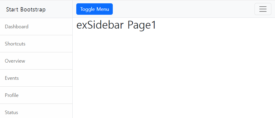
Simple Sidebar 지우고 나만의 컨텐츠 채우기

//src/main/java/com/example/ex3/controller/SampleController.java
@GetMapping({"/exLayout1", "/exLayout2","exTemplate","exSidebar"})
public void exLayout1(){
  log.info("exLayout1.......");
}
<!--src/main/resources/templates/bindex.html-->
<a th:href="@{/sample/exSidebar}">/exSidebar</a><br><!--src/main/resources/templates/sample/exSidebar.html-->
<!DOCTYPE html>
<html lang="ko" xmlns:th="http://www.thymeleaf.org">
<th:block th:replace="~{layout/basic :: setContent(~{this :: content})}">
<th:block th:fragment="content">
<h1>exTempate Page1</h1>
</th:block>
</th:block>
</html><!--src/main/resources/templates/layout/basic.html-->
<!DOCTYPE html>
<html lang="ko" xmlns:th="http://www.thymeleaf.org">
<th:block th:fragment="setContent(content)">
<head>
<meta charset="utf-8" />
<meta name="viewport" content="width=device-width, initial-scale=1, shrink-to-fit=no" />
<meta name="description" content="" />
<meta name="author" content="" />
<title>Simple Sidebar - Start Bootstrap Template</title>
<!-- Favicon-->
<link rel="icon" type="image/x-icon" th:href="@{/assets/favicon.ico}" />
<!-- Core theme CSS (includes Bootstrap)-->
<link th:href="@{/css/styles.css}" rel="stylesheet" />
</head>
<body>
<div class="d-flex" id="wrapper">
<!-- Sidebar-->
<div class="border-end bg-white" id="sidebar-wrapper">
<div class="sidebar-heading border-bottom bg-light">Start Bootstrap</div>
<div class="list-group list-group-flush">
<a class="list-group-item list-group-item-action list-group-item-light p-3" href="#!">Dashboard</a>
<a class="list-group-item list-group-item-action list-group-item-light p-3" href="#!">Shortcuts</a>
<a class="list-group-item list-group-item-action list-group-item-light p-3" href="#!">Overview</a>
<a class="list-group-item list-group-item-action list-group-item-light p-3" href="#!">Events</a>
<a class="list-group-item list-group-item-action list-group-item-light p-3" href="#!">Profile</a>
<a class="list-group-item list-group-item-action list-group-item-light p-3" href="#!">Status</a>
</div>
</div>
<!-- Page content wrapper-->
<div id="page-content-wrapper">
<!-- Top navigation-->
<nav class="navbar navbar-expand-lg navbar-light bg-light border-bottom">
<div class="container-fluid">
<button class="btn btn-primary" id="sidebarToggle">Toggle Menu</button>
<button class="navbar-toggler" type="button" data-bs-toggle="collapse" data-bs-target="#navbarSupportedContent" aria-controls="navbarSupportedContent" aria-expanded="false" aria-label="Toggle navigation"><span class="navbar-toggler-icon"></span></button>
<div class="collapse navbar-collapse" id="navbarSupportedContent">
<ul class="navbar-nav ms-auto mt-2 mt-lg-0">
<li class="nav-item active"><a class="nav-link" href="#!">Home</a></li>
<li class="nav-item"><a class="nav-link" href="#!">Link</a></li>
<li class="nav-item dropdown">
<a class="nav-link dropdown-toggle" id="navbarDropdown" href="#" role="button" data-bs-toggle="dropdown" aria-haspopup="true" aria-expanded="false">Dropdown</a>
<div class="dropdown-menu dropdown-menu-end" aria-labelledby="navbarDropdown">
<a class="dropdown-item" href="#!">Action</a>
<a class="dropdown-item" href="#!">Another action</a>
<div class="dropdown-divider"></div>
<a class="dropdown-item" href="#!">Something else here</a>
</div>
</li>
</ul>
</div>
</div>
</nav>
<!-- Page content-->
<div class="container-fluid">
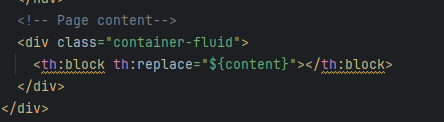
<th:block th:replace="${content}"></th:block>
</div>
</div>
</div>
<!-- Bootstrap core JS-->
<script src="https://cdn.jsdelivr.net/npm/bootstrap@5.2.3/dist/js/bootstrap.bundle.min.js"></script>
<!-- Core theme JS-->
<script th:src="@{/js/scripts.js}"></script>
</body>
</th:block>
</html>